Interface Overview
The IMGPrompt UI splits into a left picking area and a right result area, guided by three numbered steps top-to-bottom: 1 Select Object → 2 Select Attribute → 3 Select Tags.
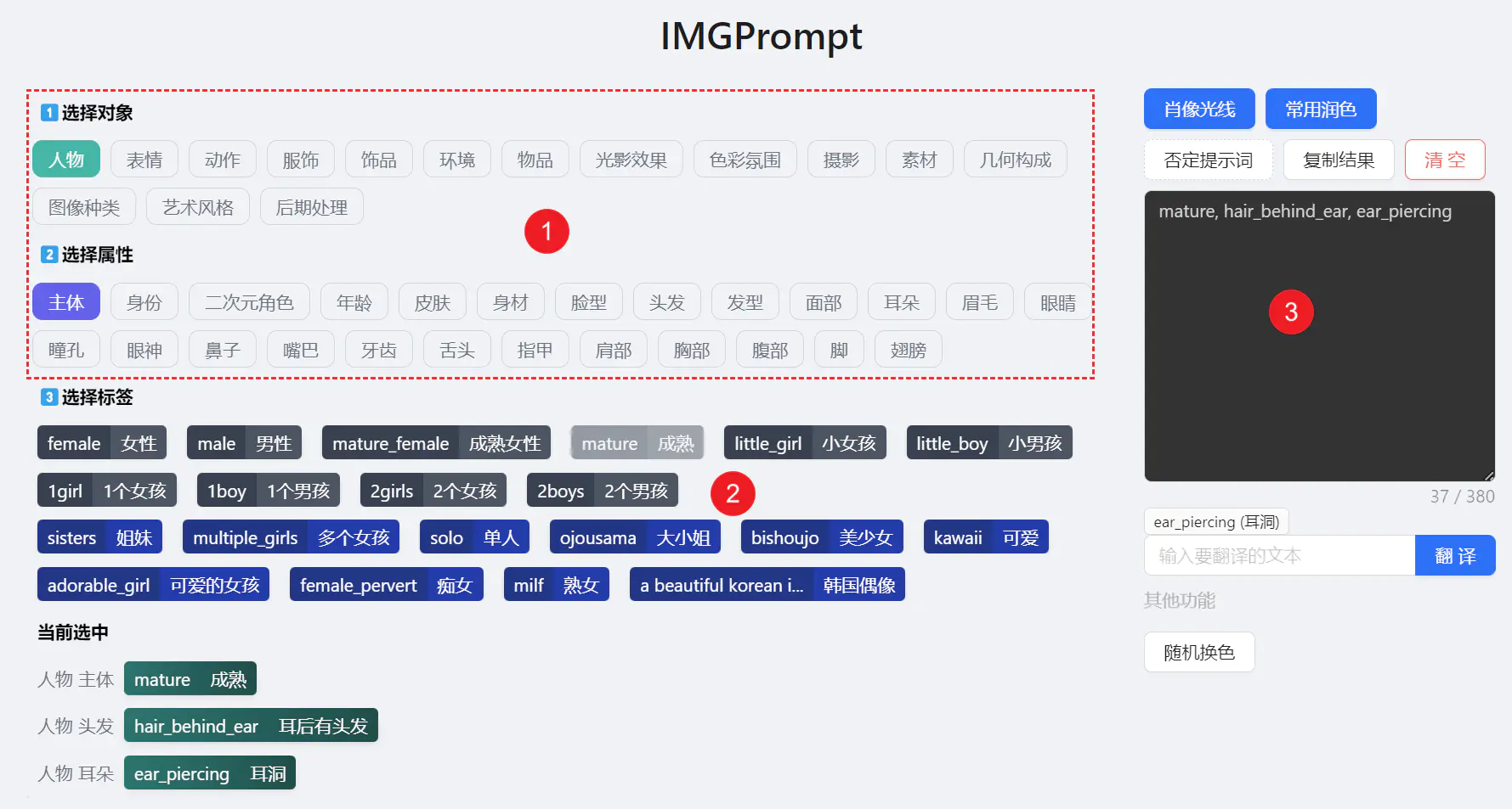
1. Select Object (Main Category)
The ① Select Object row at the top lists 16 main categories such as Character / Environment / Photography / Art Style / Lighting. Click one to switch your current subject area.
2. Select Attribute (Subcategory)
② Select Attribute dynamically updates based on your main category. For "Character" you'll see Basics / Expression / Action / Portrait / Apparel etc. Click to narrow scope further.
3. Browse & Insert Tags
③ Select Tags shows all prompts in the current scope, bilingual (English displayName + native-language langName).
Click to Insert / Remove
Click any tag to add it to the prompt box; click a selected tag to remove it. Duplicates are automatically ignored.
Hover / Long-Press to Preview, Click to Zoom 🖼️
Tags with example images surface a preview popover containing the native-language name, thumbnail, and description. On desktop it appears on hover; on touch devices (phones / tablets) press and hold the tag for ~0.5 seconds to bring it up. Click / tap the thumbnail inside to open the lightbox:
- Zoom in/out with scroll or buttons to inspect fine detail.
- Rotate by 45° / 90° to check multiple angles.
- Download to save to your local reference library.
- Keyboard:
Escto close; arrow keys where applicable.
Closing the lightbox keeps your current browsing position and selections intact — no flow breakage.
📱 Touch devices: a quick tap still adds / removes the tag — only a long-press opens the preview. While the popover is open, tap anywhere outside to dismiss it.
Multicolor vs Monochrome: One-Click Toggle 🎨
The mode switcher in the top-right offers two visual styles:
- Multicolor uses category-based color blocks — strong hierarchy, great for browsing and inspiration.
- Monochrome packs more information per row — great for quick scanning and comparison against what you've already selected.
Your preference persists in local storage for future visits.
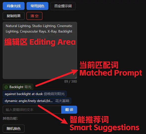
4. Right Panel — Edit & Suggest
Edit Freely
The prompt textarea accepts arbitrary input. Separate entries with commas (,) and the system auto-tokenizes, dedups, and matches against the library.
Smart Suggestions
Based on your last-typed word, up to 10 related tags are recommended (works in Chinese or English). Click to insert. If the last word matches a library entry, it renders as a green checkmarked chip.
Action Buttons
Character Counter 📊
Live character count — aim for ≤ 380 characters for better model reproducibility.
5. Shareable URLs 🔗
Your browsing state syncs to the URL:
Share the link and your teammate opens to the exact same category view. Great for:
- Team collaboration around a focused tag set
- Linking to a specific category in tutorials or articles
- Bookmarking your most-used starting points
6. Theme & Language
- Light / Dark theme — follows system or toggles manually from the nav bar.
- 18 languages — UI, tag library, and category names are fully localized. Switch from the language dropdown in the nav.
7. Quality-of-Life Details
- State persists across sessions — selections, theme, and tag mode are remembered locally.
- Runs 100% in-browser — no login, no upload, no backend.
- Keyboard accessible — all tags support Tab focus +
Enter/Spaceactivation; screen-reader friendly.